

I’m really not sure how most people select their reading material but me, I pick up anything whose cover catches my eye. I may read the synopsis and put it back down, but the fastest way to my heart is a flashy cover, practically tailored for me. I’ll even keep books on my “to be read” shelf (this shelf is total BS, if I really wanted to read it I would have devoured it long before it could have made itself onto a shelf) which I’ve tried to read and lost interest in if I really like the cover, as if one day the cover will win me over and I’ll enjoy the book. The argument here is that I’ll expose myself to far more authors and genres than I would by using some more logical method to find my books.
But here we have an example that doesn’t meet my standards at all.
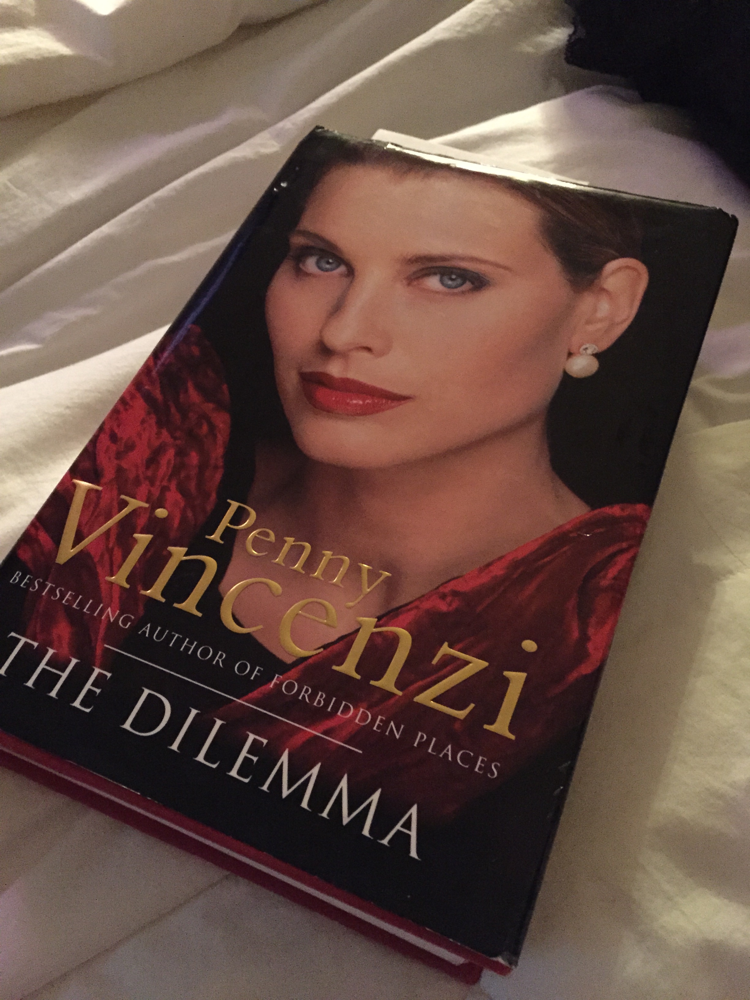
In fact, this cover is really quite dreadful. It looks like a horrible 80s biography about some big-haired lady I don’t care about. Fortunately for this particular author, I happen to have read quite a few of her works with far less distasteful covers and know that I absolutely love Penny Vincenzi’s plot lines and writing. This book was published in 1996, which as far as I remember, was long after this look was popular, but perhaps because it was published in the UK the style was a bit different? Having been to the UK, I find this explanation dubious but nonetheless, I will continue reading.
Even if it is a tiny bit embarrassing to read it in public.
